Why Every Med Spa Looks the Same (And How Not To)
Neutral palettes, thin serifs, botanical stock, and the same four words on every homepage. A creative director's view of why med spas blend together, what it costs, and how to build a brand patients can tell apart.

Open ten med spa websites in a row and you will start to lose track of which one you are on. Warm white background. A thin serif headline. A woman with closed eyes and perfect skin, lit from the side. A eucalyptus branch. Marble somewhere, gold somewhere else. A headline about natural results and renewed confidence. A banner offering 20 percent off your first visit.
None of this is bad design, exactly. Most of it is competent. The problem is that it is the same competence, applied to the same template, by people who were all looking at the same references. For a founder, that sameness is expensive in ways that do not show up until the practice is open and the phone is quieter than the business plan assumed.
This is a creative director's view of why the category looks the way it does, what that costs, and a practical way to build a med spa brand that patients can actually tell apart from the one down the street.
What sameness looks like, in numbers
In October 2026 we reviewed 31 aesthetic homepages across Dallas-Fort Worth for our DFW aesthetic branding report, including 16 med spas. The med spa findings read like a checklist of category defaults:
- The same words. "Results" and "natural" each appeared on 88 percent of med spa homepages. "Confidence" and "beauty" each appeared on 81 percent.
- The same offer. 10 of 16 showed an offer on the homepage, and half led with a first-visit discount, usually 15 to 20 percent or 50 to 75 dollars off.
- The same menu. 13 of 16 presented a broad treatment menu. Botox was named on the homepage of 15.
- Invented names, no people. 7 of the 16 used invented names. None used a founder's or injector's name as the brand.
- Missing providers. Only 5 named and pictured their providers on the homepage, and 5 did not say who owns or leads the practice at all.
The report put it plainly: the market is crowded with practices but almost empty of positions. DFW is not unusual. It is simply where we counted.
The visual side is harder to count, but anyone who has looked at enough med spa brands will recognize the pattern: a neutral palette of cream, taupe, and blush; a high-contrast thin serif paired with a light sans; marble, brass, and gold foil; botanical stock photography; models instead of patients or staff. Those are observations, not survey data, but they are consistent enough that a founder can test them in an afternoon by looking at the five closest competitors.
Why every med spa ends up here
Sameness is not a failure of taste. It is the predictable result of how most med spas get branded.
Templates come first
Website platforms, booking systems, and spa-specific agencies sell templates built to look acceptable for any practice. A template is designed to offend no one, which means it is designed to belong to no one. When the identity is chosen to fit the template, rather than the other way around, the brand inherits its defaults.
Manufacturer marketing fills the gaps
Device and injectable manufacturers supply polished campaign imagery, treatment descriptions, and co-op marketing support. It is professional and convenient, and it is the same material every other provider of that product has access to. A homepage built from manufacturer copy describes the product, not the practice. Patients learn what the device does and nothing about why they should have it done by you.
Fear of leaving anyone out
Founders are often investing heavily and want the widest possible audience. So the brand tries to speak to everyone: every age, every treatment, every budget, every aesthetic. That produces language like "personalized treatments for natural results that help you look and feel your best." That sentence fits almost every practice in the category, which is why it persuades no one.
Designers working from the same boards
Many identities start on Pinterest, in a mood board pulled from other spas, hotels, and skincare brands. Reference gathering is a normal part of design, but when the references are all from inside the category, the output can only average the category. The result is a brand that looks like a med spa, which is not the same thing as a brand that looks like yours.
What sameness costs
The cost is not aesthetic. It shows up in revenue, marketing spend, and search.
Price becomes the only difference. When two practices look and sound identical, the patient has one remaining way to choose: price. That is why the first-visit discount has become a category default. It is a symptom of sameness as much as a strategy. Practices that cannot say who they are end up competing on what they charge, and the discount rarely goes away once it starts.
People do not remember you. A patient who sees your Instagram post, then your Google listing, then a friend's recommendation, needs those moments to connect. If your name is invented, your visuals are generic, and your copy is interchangeable, the connection does not form. You pay for the same patient's attention several times.
Search treats you as generic. If your site says the same things as every other site, search engines have little reason to rank you for anything specific. Generic pages compete for generic searches like "med spa near me", where the map pack, reviews, and ad budgets decide most of the outcome. A clear focus gives you something specific to rank for. We cover that in detail in our guide to med spa SEO.
Proof stops working. Before-and-afters, review stars, and best-of badges are useful, but when every practice has them, they stop differentiating and become the minimum.
A method for not looking like everyone else
The fix is not a more unusual color palette. A purple med spa with the same words and the same discount is still the same med spa. Distinctiveness has to start with a decision and work outward into design.
1. Positioning before anything visual
Before a logo, a palette, or a name, answer three questions in writing:
- Who is this practice for, specifically? Not "women 25 to 65", but a person you could describe in a paragraph.
- What do you do better or differently than the five closest competitors?
- What will you not do, or not offer, or not say?
The third question is where most positioning becomes real. A practice that treats skin before it sells filler, or that refuses to run discount promotions, or that focuses on patients over 50, has given its designer something to design. Our med spa business plan guide shows how positioning connects to the financial plan.
2. A real point of view
A point of view is an opinion the practice is willing to say in public. "We think most people are over-treated." "We will tell you when a treatment is not worth it." "Skin health first, injectables second." A point of view gives patients a reason to choose you that has nothing to do with price, and it gives every caption, page, and consultation a consistent spine.
It also filters patients, which is the point. A brand that attracts everyone attracts mostly discount shoppers.
3. Put the provider forward
The DFW review found no med spa using a person's name as the brand, and fewer than a third naming and picturing providers on the homepage. That is an opening. Patients choose aesthetic providers the way they choose a hairdresser or a surgeon: they choose a person. Name your injectors and nurse practitioners, show them clearly, explain their training, and let them speak in their own words.
This does not mean you must name the spa after yourself. It means the people behind the needle should be visible, credible, and easy to book. If the naming question is live, our piece on practice names versus personal names lays out the trade-offs.
4. Build the visual system from your own place and story
Instead of starting from other spas, start from what is true about the practice: the building, the neighborhood, the founder's background, the materials in the room, the light at the time patients actually arrive. A practice in a converted brick building near a rail yard and a practice in a new suburban retail center should not look alike, and neither should look like a hotel lobby.
Useful prompts for a visual system:
- What colors are already in the space, the city, or the founder's history?
- What typeface would feel at home on a sign in your neighborhood?
- What texture would a patient remember from the room?
- What would you never put in the brand, and why?
5. A verbal identity with banned words
Write a short voice guide with rules, not adjectives. Include a list of words the brand does not use. A useful starting list for most med spas: natural, results, confidence, rejuvenate, transform, glow, radiant, beauty, pamper. Remove them from the homepage and see what is left. If nothing is left, the positioning work is not finished.
Replace them with specifics: what the treatment does, how long it takes, how long it lasts, who it is not for, and what the provider looks for in an assessment.
6. Photograph real people and real space
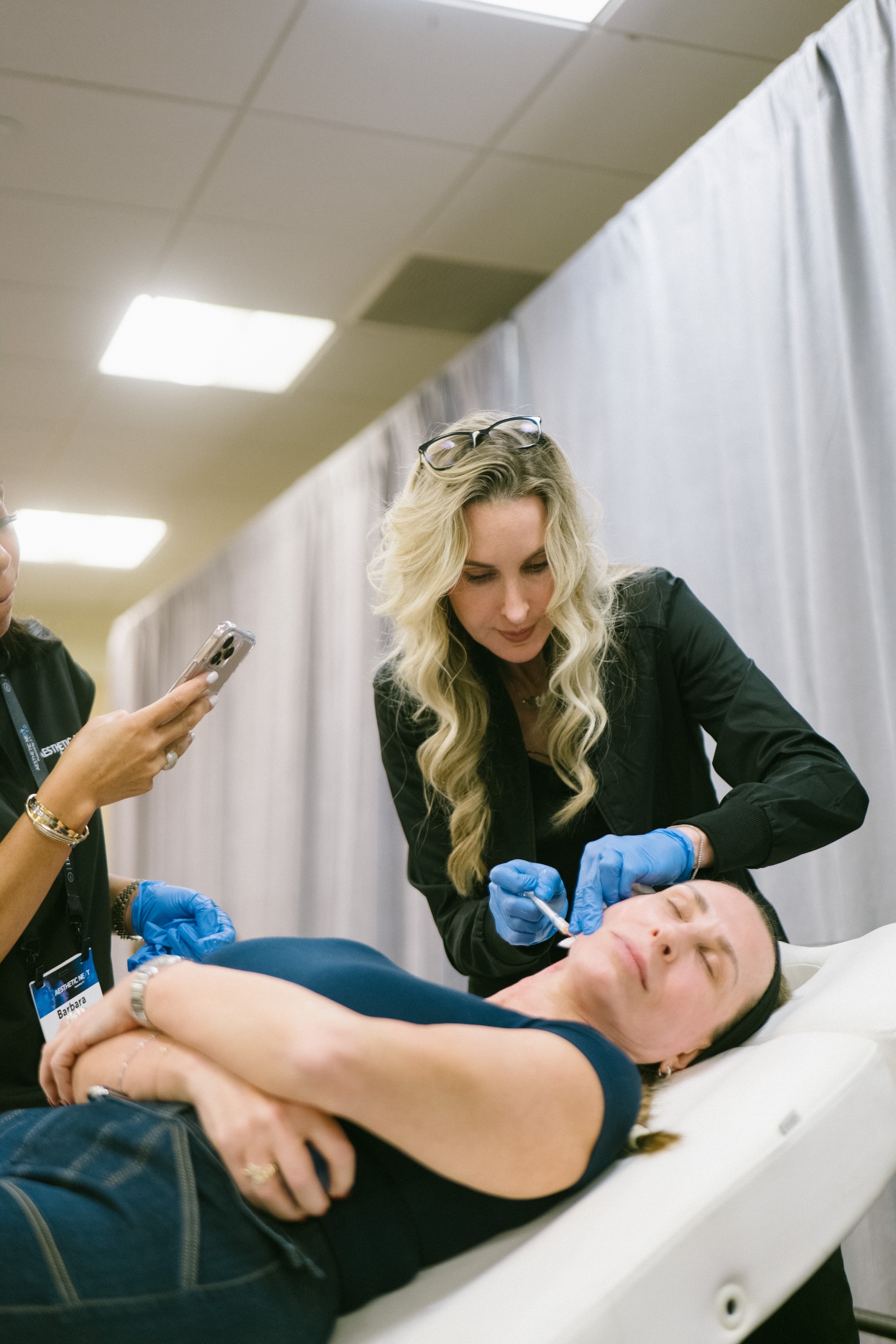
Stock models with closed eyes communicate one thing: this practice did not have its own pictures. Commission photography of your providers at work, your treatment rooms, your front desk, the details of the space, and, with documented consent, real patients. It costs more than a stock license and does more than any other single brand asset, because nobody else can use it.
Category default vs. what to do instead
| Category default | What to do instead |
|---|---|
| Cream, taupe, and blush palette with gold accents | Colors drawn from your building, neighborhood, or founder story |
| Thin high-contrast serif with a light sans | A typeface chosen for your voice and tested at small sizes on mobile |
| Marble, brass, and botanical stock imagery | Commissioned photography of your space, providers, and consenting patients |
| Invented spa name with no meaning | A name with a reason behind it: a person, a place, or a clear idea |
| "Natural results" and "renewed confidence" | Specific claims: what, how long, for whom, and what you will not do |
| Manufacturer treatment copy | Your providers explaining their approach in their own words |
| First-visit discount as the homepage headline | A position, a founding-patient offer at launch, or a clear consultation path |
| Broad menu presented as the brand | One or two signature focuses, with the full menu one click away |
| Providers unnamed or buried | Providers named, pictured, and bookable from the homepage |
Being fair to the defaults
Some of this sameness exists for good reasons. Neutral palettes read as clean, which matters in a medical setting. Serifs read as established. Patients do search for "natural" results, and a discount can fill a calendar in a slow month. The goal is not to reject every convention. It is to stop using conventions in place of decisions.
The DFW report also found practices doing this well: a neurotoxin-only studio with fixed prices on the homepage, a physician-owned med spa with an editorial voice and no homepage discounts, and a brand built entirely on restraint with its own newsletter. None of them look like each other, and none of them look like the template.
Next step
If you are opening a med spa, or rebranding one that has started to blend in, start with positioning and a point of view, then let the name, identity, and website follow from it. That is how our med spa branding work begins.
Fernando Guerrero
Founder & Creative Director, ZOE Creative IO
Fernando leads brand consulting and development for plastic surgeons, med spas, and aesthetic practices from ZOE's studio in Fort Worth, Texas. About ZOE
Why do so many med spas look alike?+
Most med spa brands are built from the same inputs: website and booking templates, manufacturer marketing materials, mood boards pulled from other spas, and a wish to appeal to everyone. Each is reasonable on its own. Together they produce neutral palettes, thin serifs, botanical stock imagery, and the same words on every homepage.
Is a neutral color palette a bad choice for a med spa?+
Not on its own. Neutral palettes read as clean and calm, which suits a medical setting. The problem is using one by default instead of by decision. If the palette, type, and imagery could belong to any practice, the brand has to work harder everywhere else, usually through discounts, to be remembered.
Which words should a med spa avoid on its homepage?+
In our review of 16 DFW med spa homepages, results and natural each appeared on 88 percent, and confidence and beauty on 81 percent. Those words are not wrong, but they no longer distinguish anyone. Replace them with specifics: what a treatment does, how long it lasts, who it suits, and what you will not recommend.
Should a med spa lead with a first-visit discount?+
Half of the DFW med spas we reviewed did. A discount can fill a slow calendar, but as the headline it teaches patients to choose on price and is hard to withdraw. At launch, a founding-patient offer, a waitlist, and a clear point of view tend to build a better patient base.
Where should med spa branding start?+
With positioning: who the practice is for, what it does differently from the closest competitors, and what it will not do. The name, visual identity, voice, photography, and website should follow from those answers, not come before them.